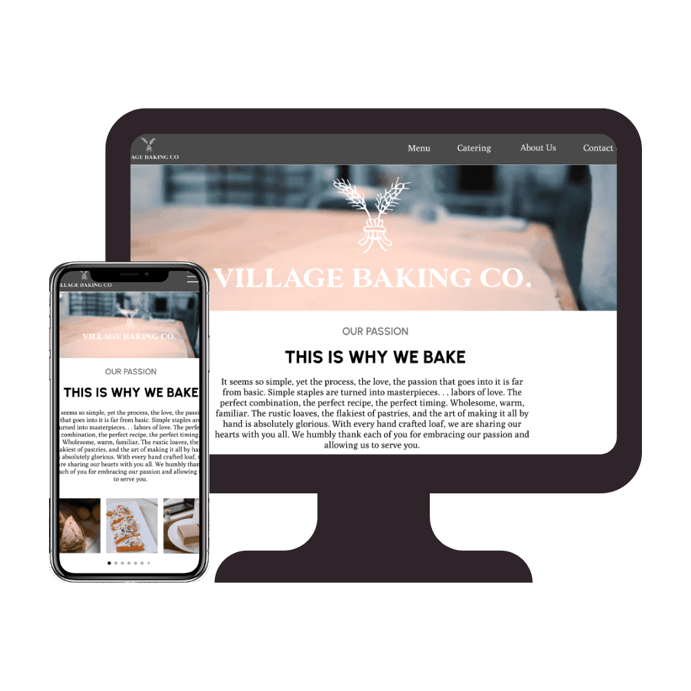
Vanilla Baking Co.
Local business website Redesign
Problem
Their current website lacks responsive web design, there are some unreliable buttons, outdated information, and inaccessible design. There are opportunities to improve the design of the overall website to improve the experience of the users and improve business outcomes.
Solution
A redesign of the Village Baking Co. website to improve navigation and usability to refine the accessibility and increase ROI.
Role
As the UX Designer on this collaborative project, I helped conduct user and market research to address key usability issues on the Village Baking Co. website. In addition, I created low-fidelity prototype sketches and used my graphic design background to craft a refreshed, accessible UI that enhanced the overall user experience.
Project Timeline
This project spanned the course of 3 weeks with checkpoints in between.
Week 1 - User research and design
Week 2 - Ideation
Week 3 and 4 - Prototyping and testing
User Research
Before research
Upon first glance, I could tell the intial website had a lot of accessibility issues. Although the color palette passed the accessibility test, the font sizing and arrangement of images made it difficult for users to view the page.
Pain Points
• No online ordering on the website – people would need to call in advance.
• Not knowing in advance what is available
• Menu is not up-to-date and hard to locate
Research Process
We wanted to target people who like to treat themselves frequently by going to a bakery or coffee shop so before conducting the interviews, we sent out a screener survey. After the survey, I conducted 2 in-person user interviews. All together as a team, we had a total of 6 interviews. One of the team members also interviewed one of the stakeholders to gather insight on what their overall goals were.
Objectives
• Understand their perception of the brand and Village Baking Co.
• Understand the experience with the website.
• Identify pain points and opportunities for improvement.
• Identify what users want from the website.
Survey Results
The survey showed us what their users do and expect out of a bakery. The main highlight was that most users visit the website before going to the actual location. With this in mind, we aimed to better the user/customer experience by narrowing our focus on what the user needs to see.
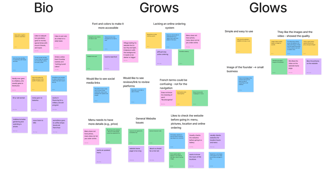
Affinity Diagram
Utilizing the data gathered from our user interviews, the team and I categorized the notes by “grows and glows”. As a result, we were able to decipher the major paint point was the overall readability of the website and the menu system.
Design
User Persona
Using the information collected from our research, we created a user persona that best fit the needs of our target audience.
Goals & Needs
• Find updated information about the products that are available
• Easily navigate through the website
• Find updated location information
Pain Points
• The fonts and coloring are not up to code for accessible design
• Menu is not up to date and lacks nutritional details
• Lack of photos of the pastries, bread, and other products
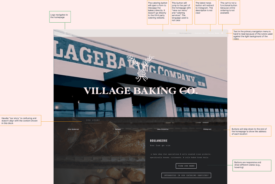
Heuristic Evaluation
Because this was a website redesign, I performed a heuristic evaluation to further investigate what we needed to improve for the website. After doing the evaluation, I annotated the website to get a better picture of what iterations we needed to make.
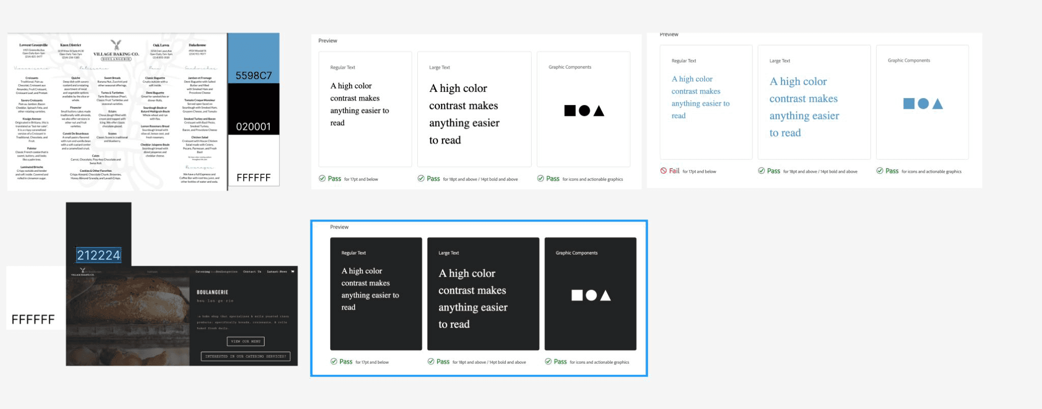
Color Accessibility Test
The original website does pass the color accessibility test but it fails at the font choices as it was difficult to read. This test was also supported separately in the user insights that stated the font was difficult to read because of the size and type.
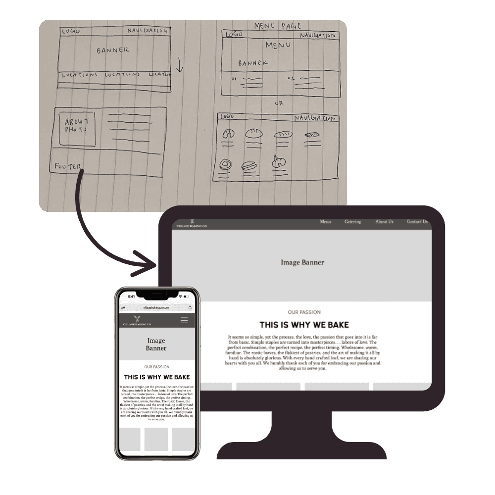
Ideation
To redesign the website to target all of the pain points we discovered, my team and I started by reworking the style kit so that all of the fonts and color scheme are accessible for the user as well as updating the images and menu items on the homepage. In addition, we added in a responsive menu, and a feature to inform users of any updates from the bakery.
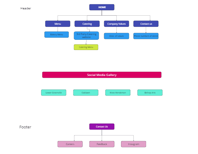
User Flow and Site Map
To better understand the flow of the website, we completed a user flow diagram of the current website. From there we created categories of each navigation to conduct a card sorting activity. As a team we sorted it the cards on our own to get a better idea of how the users would categorize each subsection. Afterwards we had 3 different people do the same. Once we had an idea of how the redesigned website should work, I directed two team members to create the site map.

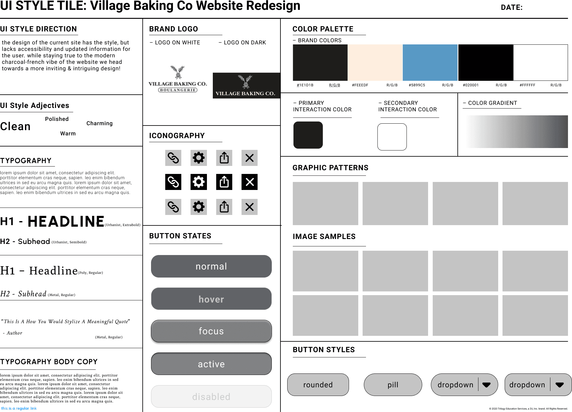
UI Style Guide
As the other team members were working on their roles, I had delegated for another team member to work on the UI Style Guide based on our findings. We had agreed upon not changing too much of the company's brand and tone because that is what they wanted to represent. However, we did change the font and colors that did not originally pass the color accessibility test.
Prototype and Testing
Usability Testing


Conclusion
This project was a valuable milestone in my growth as a UX Designer, as it emphasized the importance of balancing stakeholder expectations with user needs. By listening to users and grounding our redesign in research, we were able to enhance accessibility, streamline navigation, and ultimately improve both the user experience and the Village Baking Co.’s ROI.