Greek Clean
Simplify trash management for Greek organizations with Greek Clean
Problem
Students living in fraternities and sororities houses on campus are struggling to manage their trash effectively.
Solution
Greek Clean is a trash management app that helps make the trash pickup process more efficient and affordable.
Role
As the UX Designer on the Greek Clean project, I collaborated with a team to develop an app that simplifies trash management for fraternity and sorority houses. Despite not being the official team lead, I naturally took on an organizational role where I helped keep the team aligned and on schedule. In addition, I also contributed to user research, wireframes, and UI design to create an efficient, user-friendly solution.
Project Timeline
This project spanned the course of 3 weeks with checkpoints in between.
Week 1 - User research and design
Week 2 - Ideation
Week 3 and 4 - Prototyping and testing
User Research
Research Process
My team and I conducted 6 user interviews with current college students who live on campus in fraternities and sororities. In addition to the user interviews, we also conducted an online survey to cover more people across the country that revealed that students had an issue with trash was missed.
Objectives
• Understand their thought process and prior experience with trash pickup.
• Understand how they dispose of their trash.
• Understand how they schedule their trash to be picked up.
Survey Results
The survey showed us that although they felt indifferent about their trash picking up process, the biggest pain point was that they would miss pickup times or had trouble with cleanup. Another pain point that was mentioned was the affordability.

Competitor Analysis
There is an opportunity to increase education and awareness on trash waste disposal as well as provide better solutions.
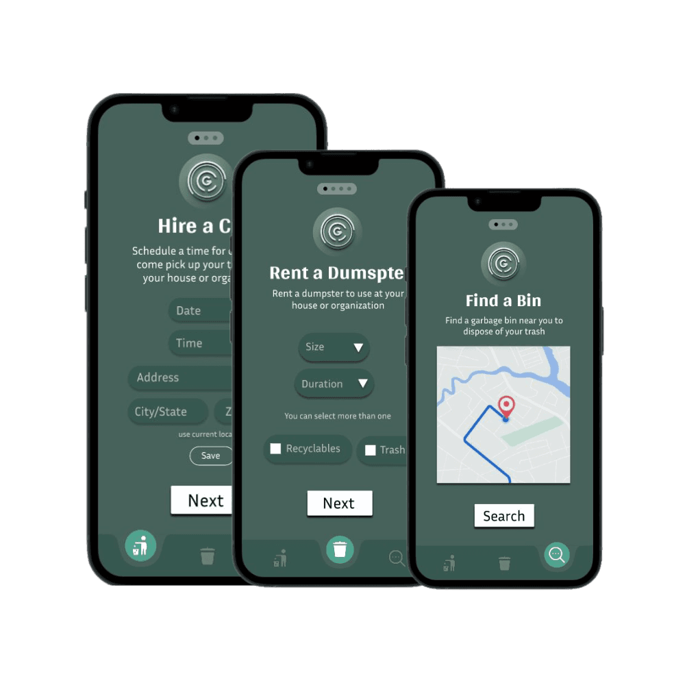
Design
Based on the findings of our user research, we knew we wanted to prioritize affordability but also different methods for our users to manage their trash. Utilizing our affinity diagram, we created the feature prioritization graph and the user flow.

User Flow


Wireframing and Prototyping
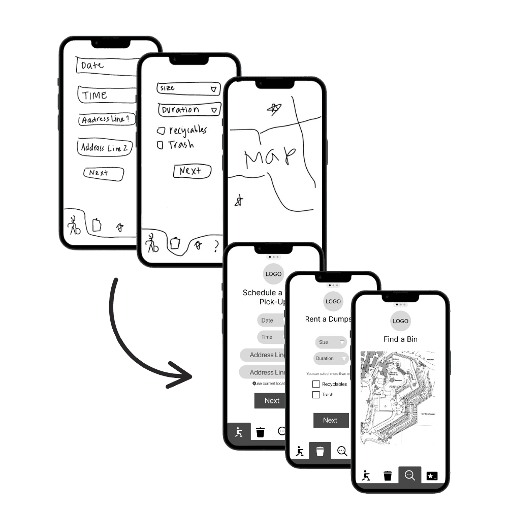
Mid-Fi Testing
Each of us worked on parts of the prototypes to improve efficiency. Once the mid-fi prototype was complete, we conducted our first round of usability testing. I was able to test 2 people on the mid-fi and as a team we had a total of 5 tests.
Through this we found that:
• Users wanted a way to opt out of the tutorial.
• Users wanted a way to go back and forth between tabs.
• There was a need for a back button in tutorials.
Hi-Fi Testing
After discussing the iterations with my team members, we went to working on the corrections. Each one taking on a different task to be more efficient. Before our final iteration, we did conduct 2 more usability testing to see if our users could easily navigate and it was a success!
Conclusion
As my first UX project, Greek Clean challenged me to step up in unexpected ways that sharpen not only my design skills but also my ability to lead and adapt. Despite limited communication from some team members, I leaned on time management and organizational strengths to help guide the project to completion. This experience taught me the value of resilience, alignment, and clear communication.